
Paint is the cheapest transformation in design — and the easiest to get wrong. Certain colors consistently make rooms feel smaller, darker, dated, or just… off, according to the designers and color experts who see the aftermath. These are the paint colors to avoid, why they fail, and the smarter shades to choose instead.
Table of Contents
Harsh Pure White
Surprising entry among paint colors to avoid: stark, blue-white (like primer white) makes rooms feel cold and clinical, and it shows every imperfection in the walls. The fix isn’t avoiding white — it’s choosing warm whites with creamy undertones (think Swiss Coffee, White Dove). They glow instead of glare.
Muddy Beige-Gray (“Greige” Gone Wrong)
Greige was everywhere in the 2010s, and the wrong undertone turns it muddy and lifeless — the rental-apartment look nobody wants. If your greige reads purple or green in your light, it’s one of the paint colors to avoid in your space. Test large swatches at different times of day; undertones reveal themselves in natural light.
Bright Primary Red
Fire-engine red raises heart rates and makes rooms feel smaller — exciting for a restaurant, exhausting for a bedroom. Designers consistently list it among paint colors to avoid for main living spaces. If you love red, try a deep oxblood or terracotta on one accent wall instead; you get warmth without the alarm.
Neon or Electric Anything
Neon lime, electric blue, hot pink — fun for about a week, then visually fatiguing permanently. These are paint colors to avoid because they dominate everything in the room and photograph terribly for resale. Get your color fix from art and accessories, which are easy to change when the novelty fades.
Dark Brown in Small Rooms
Dark brown can be rich and cozy in a large, well-lit room — but in small or dim spaces it just reads as cave. It’s among the paint colors to avoid where natural light is limited. If you crave depth in a small room, deep green or navy with good lighting works far better than brown.
What to Choose Instead
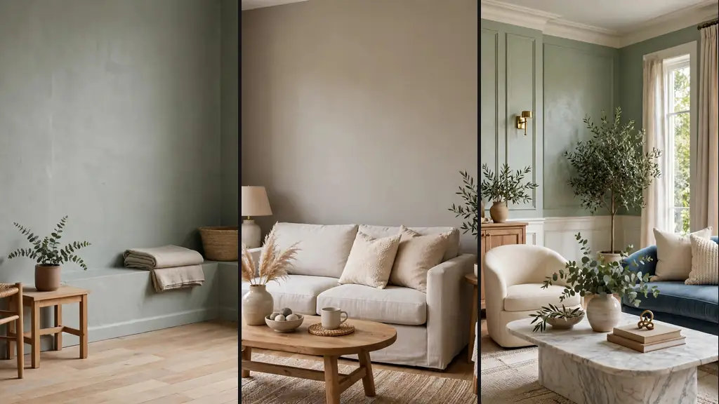
The safest palette: warm whites, soft sage greens, warm greiges with pink-beige undertones, and muted blues. These shades flatter most lighting, pair with everything, and age gracefully. Always sample first — paint two coats on a large board and live with it for 48 hours before committing. For more home guidance, see our renovation tips and decor ideas. Benjamin Moore’s color viewer lets you test shades on your own room photos.
Testing Paint the Right Way
The foolproof method for avoiding paint colors to avoid mistakes: paint large poster boards (not the wall), move them around the room for 48 hours, and view in morning, afternoon, and lamplight. Colors shift dramatically with light — the shade you loved at noon may horrify at 7pm. This single habit prevents nearly all paint regret.
Resale-Safe Color Strategy
If you might sell within 5 years, keep permanent choices neutral and put personality in easily changed decor. Among paint colors to avoid for resale: anything very dark, very bright, or very taste-specific. Buyers need to envision their life in the space, and bold walls make that harder. Save the drama for your forever home.
Ceiling Color: The Fifth Wall
Most people ignore ceilings when considering paint colors to avoid mistakes — but stark white ceilings against colored walls can look unfinished, while painting the ceiling the same color as walls (in a small room) creates a cozy cocoon effect. For drama, a dark ceiling with light walls draws the eye up and adds architecture. The ceiling is 1/6 of the room’s surface; treating it intentionally separates designed rooms from default ones.