We’ve all been there—staring at a blank wall, paint swatches in hand, completely overwhelmed by the endless sea of color choices. But don’t worry! Choosing the perfect shade isn’t just about keeping up with trends or picking what’s “in” right now. It’s an opportunity to shape your space into a true reflection of your personality and create an environment that feels just right.
In this guide, we’ll go beyond the basics and dive into the psychology of color—helping you understand how different shades can influence mood, energy, and ambiance. You’ll discover which colors to avoid, which ones to embrace, and the little-known tricks to designing a home that feels effortlessly stylish and welcoming. Let’s turn that blank wall into a masterpiece!
Paint Colors That Are Better to Avoid
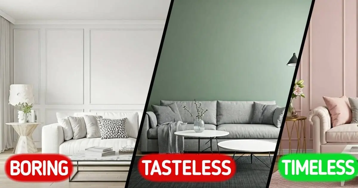
1. Stark white
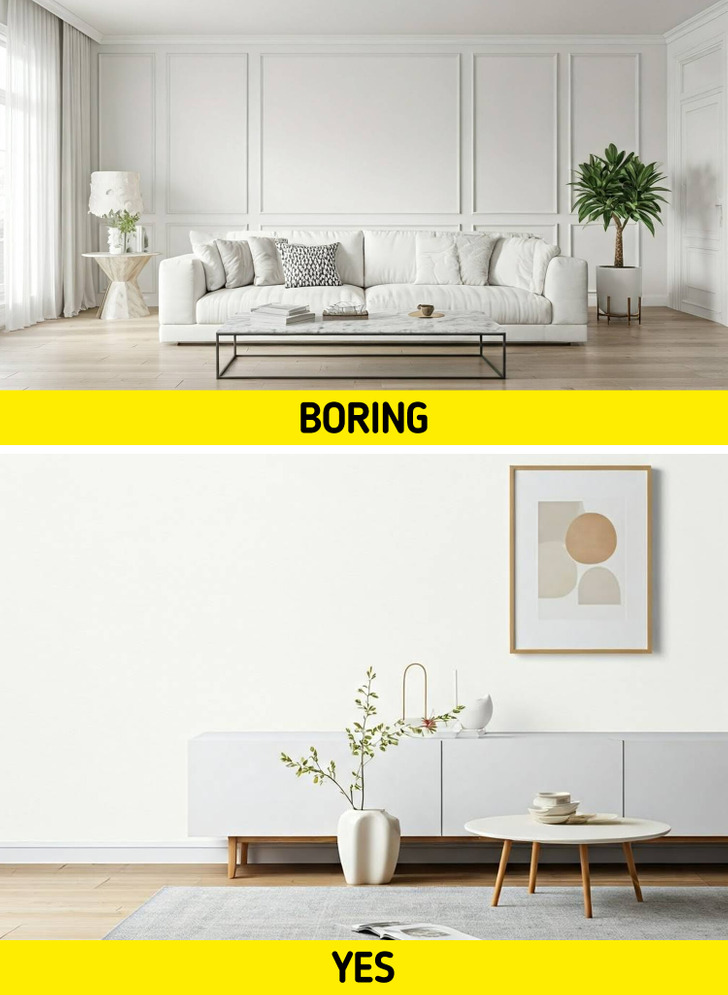
While white can be clean and modern, a stark white can feel cold and sterile, lacking warmth.
- Opt for: Soft whites, like Sherwin Williams’ Origami White (SW 7636), are timeless and can make spaces feel larger and more open. They also provide a clean backdrop for artwork and furniture.
© Jean van der Meulen / Pexels, © wuttichai1983 / Freepik, © Freepik / Freepik
2. Neon colors
While they can be fun, neon shades can be overwhelming and may not create a relaxing environment.
- Opt for: Muted pastels, like blush pink or light lavender, can add a subtle pop of color while maintaining a serene vibe. These are great for nurseries or creative spaces.
3. Very dark hues
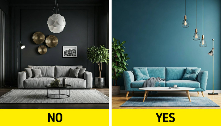
Colors like deep black or navy can make a room feel smaller and more closed in, especially in spaces with limited natural light.
- Opt for: Rich, dark hues. For a bold statement, consider deep navy or charcoal. These colors can add drama and elegance, especially in dining rooms or home offices.
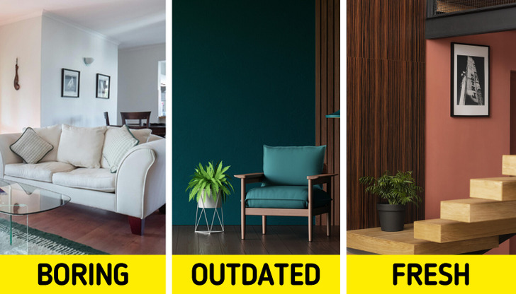
4. Browns
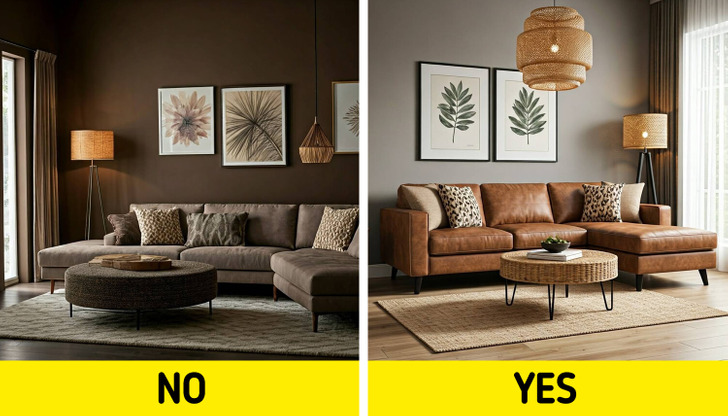
Certain shades of brown can feel dull and uninviting, making a space feel heavy.
- Opt for: Warm grays. A warm gray can add sophistication without feeling cold. It’s a great choice for modern and traditional spaces alike, providing a neutral base that allows other colors to shine.
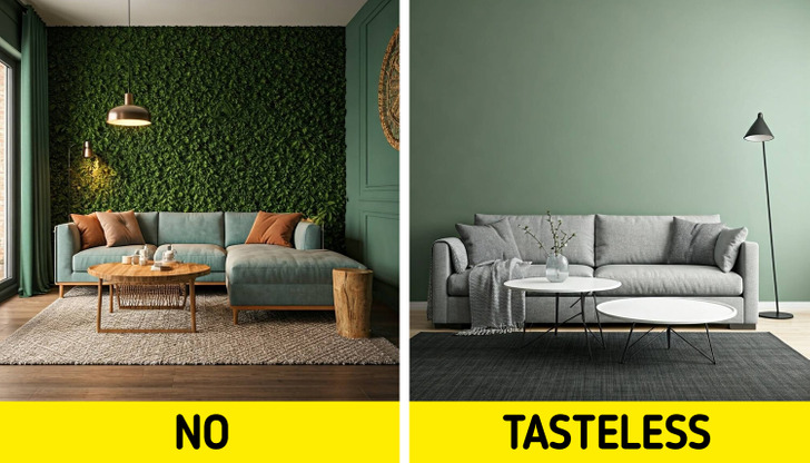
5. Bright red
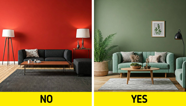
This color can be too intense and may evoke feelings of anger or anxiety, making it less suitable for living spaces.
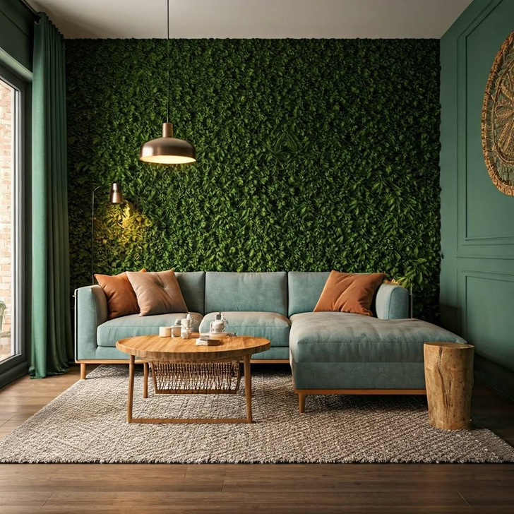
- Opt for: Earthy greens. Shades like sage or olive green bring a touch of nature indoors and can create a refreshing and serene atmosphere. These colors work well in living rooms and kitchens.
6. Icy tones
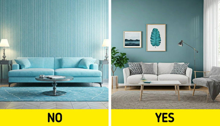
Colors like icy blue or mint can feel too clinical and may not provide the cozy atmosphere many desire.
- Opt for: Soft blues. Light blues can evoke a sense of calm and tranquility, making them perfect for bedrooms and bathrooms. They pair beautifully with white trim and natural wood accents.
7. Saturated colors
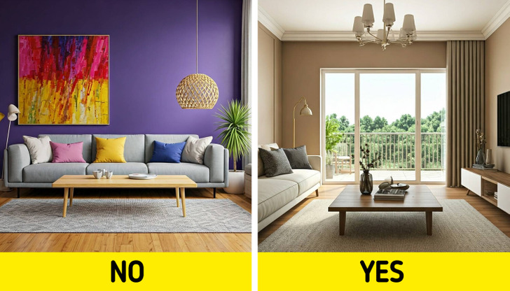
Extremely vibrant colors can be visually exhausting and may clash with other elements in your decor.
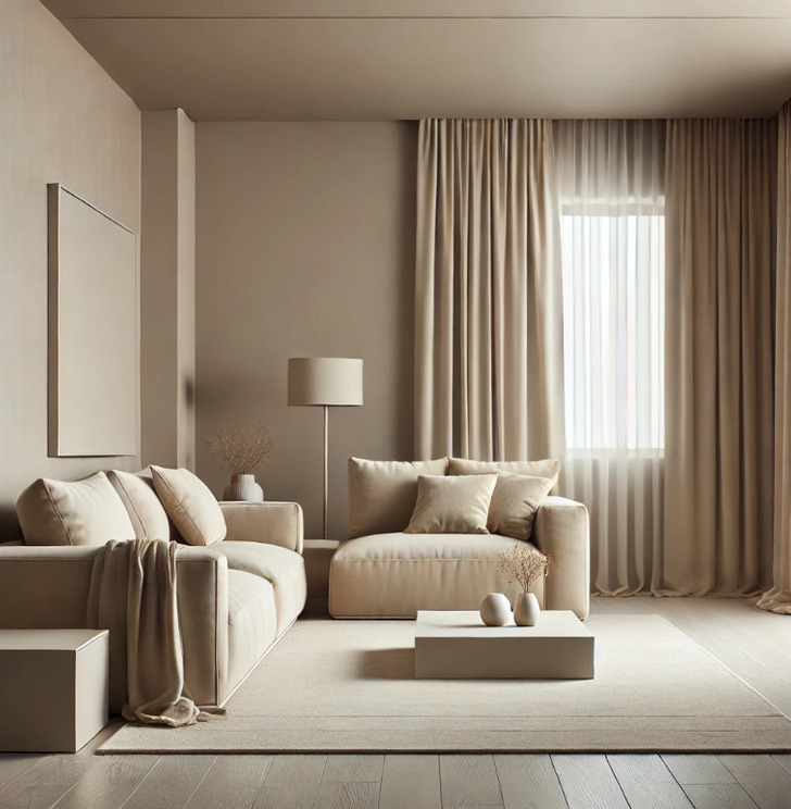
- Opt for: Warm neutrals. Shades like beige, taupe, and warm grays are versatile and create a cozy environment. They work well in any room and can easily complement various decor styles.
8. Lime green
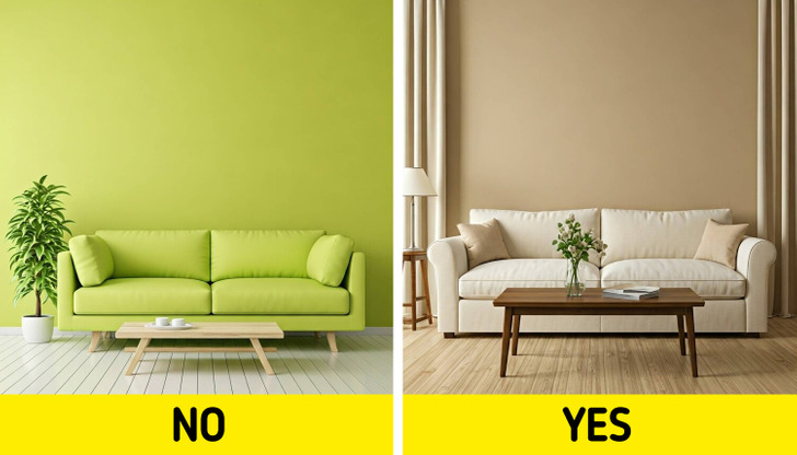
This color can be jarring and may not blend well with other colors in your home.
- Opt for: Warm beige. A classic choice that adds warmth and can make a space feel inviting. It’s especially effective in entryways and living rooms.
9. Peach
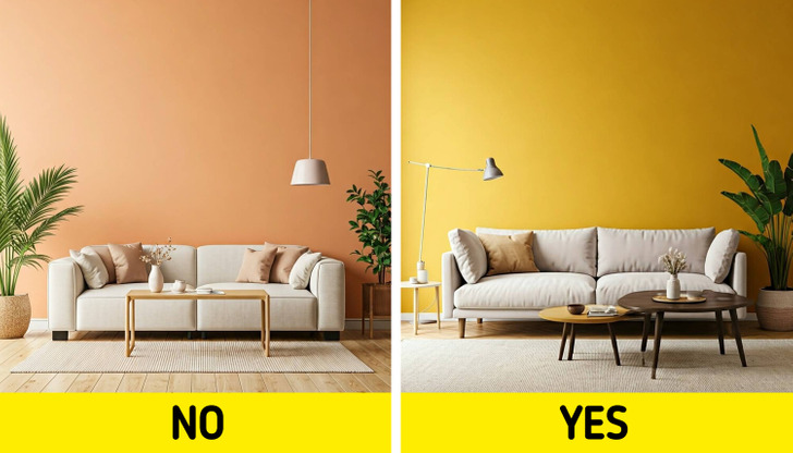
While it can be warm, certain shades of peach can feel dated and may not appeal to everyone.
- Opt for: Accent colors. Don’t forget about accent walls! Colors like deep teal or mustard yellow can add character and interest without overwhelming the space.
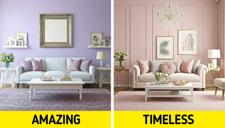
10. Overly trendy colors
While trendy colors can be exciting, they may quickly feel dated.
- Opt for: Timeless classics. Stick to colors that have stood the test of time, like warm neutrals, soft blues, and classic whites. These colors will always be in style and create a timeless feel.
11. Matching everything
Using the same color throughout your home can create a monotonous and boring atmosphere.
- Opt for: Color schemes. Choose a color scheme that incorporates different shades and tones of the same color family, or use complementary colors to create visual interest.
Choosing the right paint color is just the beginning—pair it with vibrant decor, and your home will come alive. Don’t miss our guide to 10 vibrant home decor pieces that can instantly banish boredom and boost your mood!
credits by: Brightside.me