
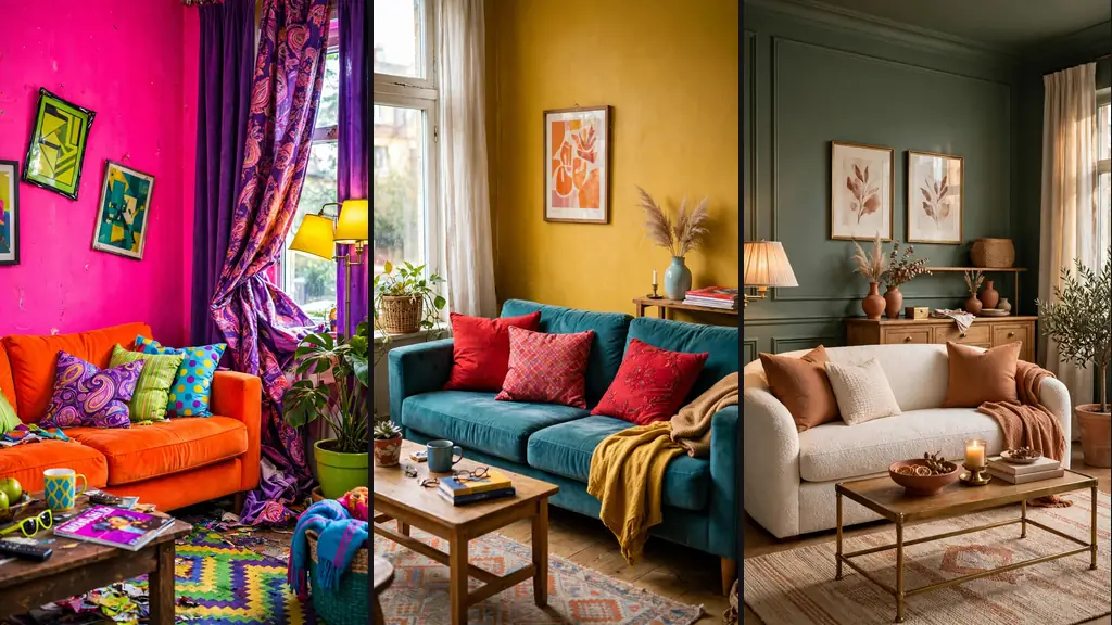
Bad color combinations in your home can ruin even expensive furniture. Color is the first thing anyone notices and the hardest to unsee — get it wrong and the whole room feels off, even if nobody can say why. Designers see the same clashing pairs repeatedly. Here’s what to avoid and what to do instead.
Table of Contents
Red and Green (Outside December)
Powerful separately, Christmas together. Red and green in equal measure scream holiday season year-round, which makes a living room feel like a seasonal display. The problem is cultural association — it’s nearly impossible to see this pairing without thinking of December.
The fix: separate them with neutrals, or shift one. Deep burgundy with sage can work; fire-engine red with kelly green cannot. If you love both colors, let one dominate and relegate the other to tiny accents — or better, enjoy them in different rooms.
Orange and Purple
Both are loud, both demand attention, and together they create visual chaos. Orange’s warmth fights purple’s coolness with no referee. In small doses — a burnt-orange pillow on a plum chair — it can look intentional and bohemian. In large doses, it looks like a sports team locker room.
If you’re drawn to this combo, mute one side: terracotta with dusty lavender, or amber with deep eggplant in small amounts. The muted versions keep the interesting contrast without the shouting match.
Brown and Black Together
Both dark, both heavy, and together they just look muddy. Black furniture against dark brown floors, or chocolate walls with black trim — the room loses all definition and feels like a cave. Neither color gets to shine because they’re too similar in value.
Separate darks with contrast: black looks sharp against cream, white, or light wood; brown glows against warm whites and caramels. If you must pair them, add a strong light element between — a light rug, pale curtains — to give the eye somewhere to rest.
Neon Anything With Anything
Neon colors vibrate. That’s not a metaphor — high-saturation brights literally create an optical vibration effect that tires the eyes. A neon accent in a neutral room can be fun and modern. Neon paired with another strong color is a headache in paint form.
One neon per room, maximum, surrounded by calm neutrals. Neon pink with white and gray? Chic. Neon pink with lime green and orange? Nightclub. Let the single bright be the star; everything else supports.
Yellow and Gray (the Wrong Way)
This was a trendy combo that goes wrong more than right. The issue: most people pair a murky mustard yellow with a cold blue-gray, and the result looks institutional. The undertones fight — warm yellow against cool gray creates visual tension.
It can work when undertones align: warm buttery yellow with warm greige, or a clear lemon with a soft warm gray. Test large swatches together in your actual light before committing. Undertone matching is the whole game with this pair.
Pink and Red Clashing
Pink is red’s lighter sibling, so pairing them seems natural — but the wrong shades clash badly. Blue-based hot pink with orange-based red creates a jarring vibration. They compete instead of harmonizing, and the room feels unsettled.
The safe version: keep them in the same undertone family. Warm coral-red with warm peachy pink works; cool fuchsia with cool cherry red works. Or separate them entirely — pink in the bedroom, red in the dining room. Related colors need careful handling, not casual mixing.
Too Many Bold Colors at Once
The most common of all bad color combinations isn’t a pair — it’s a crowd. Teal sofa, red rug, yellow curtains, purple art: individually fun, collectively exhausting. Without a neutral foundation, bold colors have nothing to rest against and the room feels chaotic.
The designer rule: 60-30-10. Sixty percent dominant neutral, thirty percent secondary color, ten percent accent pop. Every bold needs a calm to play against. If your room feels “loud,” the cure is almost always adding neutrals, not removing color.
How to Fix a Bad Combo Fast
Already living with a clash? Don’t repaint everything. The fastest fixes: add neutrals (white, cream, natural wood, greenery) to separate fighters; reduce one color to small accents; or bridge with a transitional shade that shares undertones with both.
Textiles are your low-commitment laboratory — pillows, throws, and rugs let you test combinations for $50 instead of $500. And when in doubt, photograph the room: cameras reveal color clashes our adapting eyes miss. Trust the photo over your in-person impression when judging bad color combinations in your home.